


- Styled stacks combine visual appeal with functional organization, creating a calming bedroom environment that supports better sleep through reduced visual clutter and improved aesthetics.
- The best bedroom stacks use soft textures, neutral colors, and intentional layering to enhance relaxation without creating visual chaos or stress in your sleep space.
- Strategic placement of decorative piles—on nightstands, benches, and shelves—keeps sleep-essential items accessible while maintaining the serene atmosphere your mind needs for quality rest.

Your bedroom is supposed to be your sanctuary. Yet many of us live with chaos tucked into corners—piles of blankets on chairs, stacks of books on floors, heaps of pillows everywhere. The good news? Those piles don't have to look messy. They can actually look beautiful. More importantly, they can support the calm, organized sleep environment your brain desperately needs.
Styled stacks are decorative piles that serve a real purpose. They're not just for magazines. They're a practical way to keep your bedroom organized while creating the kind of peaceful visual landscape that helps you unwind. When your eyes scan your bedroom before sleep, organized, intentional stacks feel soothing. Random piles create low-level stress that interferes with your ability to relax.
This guide will help you master the art of the styled stack. You'll learn how to create beautiful, purposeful piles that enhance your sleep environment rather than detract from it. Whether you're organizing cozy blankets, favorite books, or decorative pillows, we'll show you how to do it in a way that looks intentional, feels calming, and actually makes your bedroom more restful.
Understanding the Connection Between Visual Organization and Sleep Quality
Before we dive into the how, let's talk about why styled stacks actually matter for sleep.
Your brain is constantly processing your environment, even when you're not actively thinking about it. Scientists call this "visual cognitive load." Basically, your mind works harder in chaotic spaces. When your bedroom is visually cluttered, your nervous system stays slightly activated. It's harder to shift into the relaxed state you need for sleep.
Conversely, organized spaces with intentional visual elements help your nervous system settle. This is backed by environmental psychology research. Studies show that people sleep better in organized, aesthetically pleasing spaces than in cluttered ones. The organization itself communicates safety to your brain. It signals that everything is in its place, everything is under control, and you can safely relax.
Styled stacks bridge the gap between function and calm. They're the middle ground between "everything must be hidden away" and "chaos is fine." A beautiful stack of textured blankets on a bench at the foot of your bed serves a purpose (easy access to warmth) while also creating a visually intentional element that feels planned rather than messy. Your brain recognizes the difference.
The key is that these stacks must look intentional. Random piles feel stressful. Purposeful stacks feel curated. This distinction changes how your nervous system responds to your space.
![]()
The Foundation: Choosing What to Stack
Not everything belongs in a styled stack. The best candidates are items you use regularly or items with visual appeal.
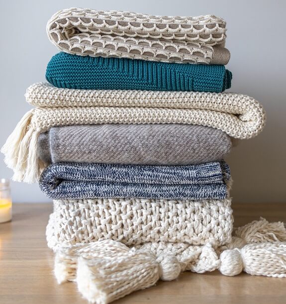
Sleep-adjacent items make the best stacks. Think cozy blankets, decorative pillows, soft throws, and lightweight quilts. These items have texture, they're touchable, and they're beautiful when arranged thoughtfully. Stacking a weighted blanket with a linen throw and a quilted coverlet creates visual interest while keeping comfort items within arm's reach.
Books are classic stack material, especially in bedrooms. They add height variation and visual sophistication. Bedroom books should be chosen with care, though. Sleep experts recommend reading physical books before bed rather than screens, so having a curated selection of books on your nightstand or a small bedroom shelf makes sense. A stack of books next to your bed signals relaxation and reading-before-sleep vibes.
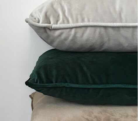
Decorative pillows are another natural choice. If you have multiple throw pillows, stacking them looks infinitely better than scattering them. A vertical stack of 3-4 pillows in coordinating colors creates a focal point while using less visual real estate.
What shouldn't be stacked? Random items, clutter, things you don't actually use, and anything that doesn't feel intentional. If you're stacking things just to clear floor space, it still feels chaotic. The stack needs a purpose and a visual logic.
The Science of Texture, Color, and Visual Calm
Styled stacks work because of how we process visual information. Texture, color, and arrangement all influence how restful your space feels.
Texture is crucial. When stacks include varied textures—a smooth cotton blanket layered with a chunky knit throw, topped with a silky pillowcase—they become visually interesting without looking busy. Your eye appreciates the variation. This is especially important in bedrooms, where you want visual interest that doesn't stimulate. Hard, shiny, plastic textures create visual tension. Soft, natural textures (cotton, linen, wool, quilted fabrics) feel calming to look at.
Color psychology matters more than you might think. Neutral tones—whites, creams, soft grays, warm beiges—create a calm foundation for stacks. If you're using colored items, keep the palette limited. A stack with five different colors reads as chaotic. A stack with two or three coordinating colors feels intentional. The research is clear: cool tones and soft neutrals support relaxation better than bright, saturated colors.
Visual rhythm is how your eye moves through a space. When stacks follow a pattern—largest item on the bottom, gradually smaller items stacked on top, or items arranged by color gradient—your eye can follow the progression easily. This creates a sense of order that feels soothing. Random arrangements require your brain to work harder to make sense of them.
The goal is for your brain to look at your styled stacks and feel "that looks intentional and organized" rather than "that's just a pile." The difference is in the thought you put into texture, color, and arrangement.

Creating Styled Stacks in Your Bedroom: Room-by-Room Guidance
Different areas of your bedroom benefit from different stacking strategies.
Stacks at the Foot of the Bed
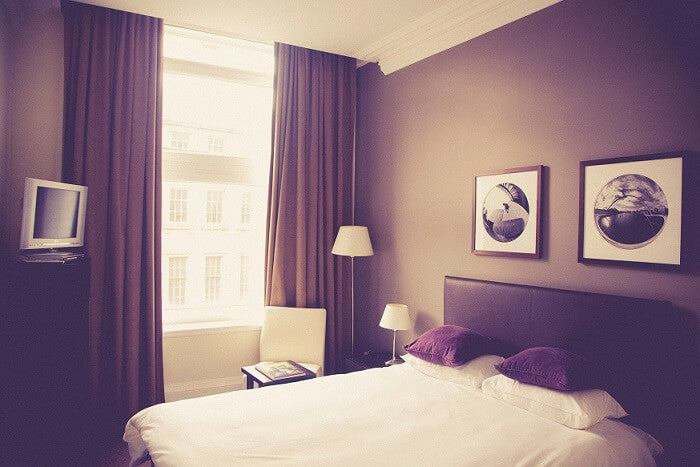
This is prime real estate for a styled stack. A bench or the bed itself at the foot creates a visual anchor for the room. Here, you can stack heavier items—quilts, weighted blankets, chunky throws. These are items you actually use. Arrange them by texture and color, largest to smallest. A weighted blanket (visual base) topped with a lighter linen throw, then a decorative pillow creates visual interest and easy access to comfort items. This stack serves a real purpose while looking intentional.
Nightstand Stacking
Nightstands are functional display spaces. A stack of 2-3 books next to a bedside lamp with a decorative object on top creates visual interest without overwhelming the space. Keep stacks modest (no more than 6-8 inches tall) so they don't interfere with your lamp's function or create a barrier between you and nighttime necessities. Use bookends to stabilize stacks and create cleaner lines.
Shelf-Based Stacks
Bedroom shelves offer vertical stacking opportunities. Lay some books flat, stand others upright, and lean a few at an angle. Include a decorative object or two—a small plant, a framed photo, a candle. This variation in orientation and object type creates visual rhythm. The key is not filling every inch of shelf space. Negative space (empty shelf area) is actually what makes organized areas feel calm. Crowded shelves feel chaotic.
Stacks on a Bedroom Bench or Chair
If you have a bench at the foot of your bed or a reading chair, this is an excellent location for a larger stack. You can layer blankets, pillows, and throws in a way that looks intentional and creates an inviting focal point. This stack should look touchable—something someone would want to curl up with. Choose textures and colors that coordinate with your bedding for visual cohesion.
The Styling Process: Step-by-Step Instructions
Creating a magazine-worthy stack isn't complicated. Follow this process.
Step 1: Gather your items. Pull together all the pieces you want to include in your stack—blankets, pillows, throws, books, whatever. Lay them out so you can see everything at once.
Step 2: Assess color and texture. Look for items that coordinate in color or complement each other. You want 2-3 dominant colors maximum. Note the texture variety. Do you have smooth, chunky, and silky textures? Good. Do you have five different textures? You might need to edit.
Step 3: Choose your largest base item. The bottom of your stack should be the largest or heaviest item. A quilted blanket, a weighted blanket, or a chunky throw works well. This creates visual stability and literally keeps the stack stable.
Step 4: Layer thoughtfully. Add items in order of descending size or weight. If you're stacking blankets and pillows, a large blanket on the bottom, a medium throw on top, then pillows creates natural visual hierarchy. Vary the direction slightly—if one blanket is folded widthwise, fold the next lengthwise. This creates subtle visual interest.
Step 5: Add a finishing touch. Top your stack with something visually interesting—a decorative pillow, a folded scarf, or a soft blanket draped just slightly off the top. This is what catches the eye and makes the stack feel intentional rather than functional.
Step 6: Step back and assess. Does it look balanced? Does your eye naturally land on the stack? Does it feel intentional? If something feels off, adjust the arrangement or swap items.
Common Mistakes to Avoid
Even well-intentioned stacks can miss the mark. Watch out for these pitfalls.
Stacking too high. A stack that reaches six or eight inches is visually interesting. A stack that climbs twelve inches feels unstable and chaotic. Keep stacks compact and bounded.
Including too many colors. Five different colors in one stack looks random. Three colors maximum. Better yet, two colors with varying tones and textures.
Mixing textures awkwardly. Silky, chunky knit, smooth cotton, and rough linen can all work together, but they need to be arranged thoughtfully. Don't mix textures randomly.
Forgetting function. A beautiful stack that you can't actually access isn't helpful. Styled stacks should include items you use. Keep comfort items accessible.
Overcrowding your room. One or two well-styled stacks per room is plenty. Three stacks in a bedroom starts to feel chaotic again. Let your stacks breathe.
Ignoring visual balance. If your stack is on the left side of your room, balance it with something on the right—a lamp, a shelf, a plant. Unbalanced rooms feel unsettled.
Maintenance and Refresh
The beauty of styled stacks is that they're not permanent. As seasons change, as you acquire new items, as your mood shifts, your stacks can evolve.
Seasonal swaps make sense. In winter, heavier blankets and warmer textures (wool, chunky knits) create visual warmth. In summer, lighter linens and breathable fabrics feel more appropriate. Rotating these seasonally keeps your bedroom feeling fresh.
Regular refreshing prevents stacks from feeling stale. Every few weeks, slightly rearrange your stacks. Swap the order of blankets. Add a new book. Remove an item that's not working. This keeps the space feeling intentional and prevents it from becoming background noise.
Decluttering as part of styling. If you're gathering items for a stack and realize you don't actually use them, don't include them. Styled stacks shouldn't be hiding spots for things you don't love. They're showcases for things you actually use and appreciate.

Making Styled Stacks Work for Your Sleep Sanctuary
The ultimate goal is a bedroom that feels restful. Styled stacks are one tool toward that goal.
A well-organized, visually intentional bedroom communicates safety to your nervous system. When you walk into your room and see organized, thoughtful stacks instead of chaos, you immediately feel calmer. This calm translates to easier relaxation at bedtime, faster sleep onset, and better overall sleep quality.
Your styled stacks should make you happy to look at. If stacking feels like a chore or your stacks don't reflect your style, they won't serve their purpose. The goal is beauty that supports function, function that looks intentional, and visual calm that helps you sleep.
Start with one stack. Choose a location that matters to you—maybe the foot of your bed or your nightstand. Gather items you love, arrange them with intention, and notice how it feels to have that organized, beautiful space in your bedroom. Then expand from there.
Your bedroom is your sanctuary. Styled stacks are one way to make it feel like the calm, organized, restful space you need for truly good sleep. They're not about perfection. They're about intentionality. And that intentionality is the foundation of a sleep space that actually supports the rest you deserve.